Lukhman

Product designer from India with 3+ years of experience, designing for both form and function.
Latest case study

Product designer
Currently at WebYes
 Accessibility
 B2B SaaS
 Design system
 AI-focused
Product designer from India with 3+ years of experience, designing for both form and function.
Latest case studyProduct designer
Currently at WebYes
AccessibilityB2B SaaSDesign systemAI-focused
 Protected
Product Design · Enterprise SaaS · 2025
From 0 → a full accessibility SaaS platform: one design language across the web dashboard, WordPress plugins and browser extensions.
 Protected
Product Design · Design System · 2025
An accessibility-first, three-tier tokenised system built with AI in two weeks, used by designers, PMs and engineers across eight platforms.

Product Design · Enterprise SaaS · 2024
A platform for Vendor management.

0 to 1 · Health Tech · 2026
Maa turns a clinical vision and hearing screening into five short games, solo-designed and shipped in 3 weeks for Figma x Contra's Config Makeathon 2026.
3+ years building SaaS products, design systems, AI and automation.
Outside work, it's fitness and poetry.
Download resume


 View project ↗
Free vision and hearing screening for children, hidden inside five short games.
Health tech · 0 to 1
 View project ↗
Compare what your salary is actually worth in another country.
Calculator · Data viz
 View project ↗
The playground name game, rebuilt as a small, well-made web toy.
Web toy · Motion
 View project ↗
A memory game about pairs, timing and how good a flip can feel.
Game · Interaction


Had a great case study review session with Lukman this morning. He shared feedback I hadn’t noticed, and his eye for detail really helped me prep for my next interview. Lukman is a great listener and communicator, and his kindness makes his guidance even more valuable. Really grateful for his time, it was super helpful!
A highly insightful and practical portfolio review session. The feedback was clear, actionable, and based on real-world UX experience rather than textbook rules. The discussion helped me rethink my case studies, improve my design thinking, and gain a fresh perspective as a UI/UX designer. Truly valuable and highly recommended.
This 30-minute session was highly beneficial for my career development, as it clarified many of my questions. It helped me identify my areas for improvement and gaps in my knowledge. This is, without a doubt, the most valuable session I have ever attended.
The session was really helpful, helped me with my design changes and what should be done to improve and more.
Notes on accessibility, research and the small details of product design, published on LinkedIn.
Case 04Figma × Contra Config Makeathon 2026
Designing a vision and hearing screening that children think is a game
Children do not report vision or hearing problems, because they have no baseline to compare against. Conditions like amblyopia are highly treatable in early childhood, but the treatment window largely closes around age seven.
Eyes, focus and hearing
Maa is a free, browser-based screening for children aged 2 to 8: five short games that check a child's eyes and ears, and hand the parent a doctor-ready report in about three minutes. Designed and shipped solo in three weeks, as a live product rather than a prototype, and tested end to end with real children.
Play MaaResearch, game design, UI, the trust layer and the doctor's report, shipped as a live product in Figma Make rather than a prototype on slides.
Every screening signal comes from the child's own taps, drags and responses to sound, so the result is identical on a ₹6,000 phone and a ₹60,000 phone.
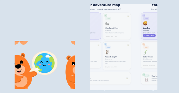
A lion checks the eyes and animals test the ears. The child plays through five levels while calibrated thresholds do the screening.
End-to-end sessions with children aged 3 to 7, and a clinical-style report that informs without diagnosing, which a parent can hand to a doctor.
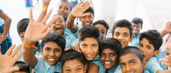
Children don't report vision or hearing problems, not because they hide them, but because they have no baseline. The problem is silent by nature, and the cost of silence is permanent: conditions like amblyopia (lazy eye) are highly treatable in early childhood, but the treatment window largely closes around age seven.
India has no universal childhood screening program (unlike the USA, UK, Singapore or Australia). A screening today means a specialist visit: a cost, a journey, often a city. So for millions of families, the first "test" a child gets is failing to read the blackboard, years too late. The design question: could a screening reach a child before the system does, at home, free, on whatever phone the family already owns, run by a parent with no training?
I studied how professionals actually screen young children: the cover test for amblyopia, Hirschberg-style fixation checks for strabismus, Ishihara plates for colour vision, convergence testing for focus, and the principles of paediatric audiometry. Each has a behavioural core (a stimulus and an observable response), which meant each could be reframed as a game mechanic without inventing new science. Maa has two users with opposite needs: the child (2 to 8) is the player, pre-literate and motivated only by fun; the parent is the operator, anxious and terrified of the word "diagnosis."
A four-year-old can't self-report blur. But they can tap a lion, follow a star, and point at what they hear. Play isn't a coating on the test. Play is the test.
The real barrier was emotional: "what if it says something is wrong with my child?" The product had to promise a screening, never a diagnosis. This became a hard language rule on every screen.
Existing "eye-test apps" lean on front cameras, but camera quality varies wildly across devices. A screening whose accuracy depends on the price of the phone would systematically fail the families Maa exists for.
The first concept used the front camera to track eye movement. Testing across devices made the flaw obvious: the same child, the same test, different phones, different results. That's not a screening; that's a lottery weighted by income.
"A test must work the same on a ₹6,000 phone and a ₹60,000 phone. If it doesn't, it isn't screening children; it's screening their parents' wallets."
The pivot: the camera is used only for presence detection (confirming a child is in front of the screen), never for measurement. Every clinical signal comes from interactions that behave identically on any device: tap accuracy, tap position, response time, drag-to-follow paths, and responses to channel-isolated audio. This decision cascaded through the whole system. It set the equity principle, simplified the privacy story (no video is stored or analysed), and became the story the community responded to most.
The screening is framed as an adventure: five levels, five animal guides, five brand colours. The flow: choose language → tell us about your child → pre-flight checks → adventure map → five levels → results → doctor's report. A parent sets up in under a minute; the child only ever sees the game.
| LEVEL | CONDITION SCREENED | GAME MECHANIC | WHAT IT MEASURES |
|---|---|---|---|
| 1 · Lion | Lazy eye (amblyopia) | Cover one eye "like a pirate", tap the lion as it pops up | Left-vs-right response time and miss-rate asymmetry |
| 2 · Elephant | Misaligned eyes (strabismus) | A star appears at five fixation points; child taps it | Directional tap offset and drift from target |
| 3 · Chameleon | Colour vision | Five Ishihara-style plates; child names the hidden animal | Correct identifications, incl. a reversal catch-plate |
| 4 · Owl | Focus & depth (convergence) | Owl moves near and far; child reports blur and drags to follow | Blur reports at approach distances, tracking smoothness |
| 5 · Rabbit | Hearing | Stereo headphones play animal sounds to one ear at a time, fading softer | Per-ear accuracy and left-right asymmetry |
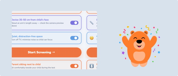
Before any level begins, a pre-flight checklist confirms the environment: parent seated beside the child, device 35 to 50 cm from the face, and a quiet room. The parent must actively toggle all three, a deliberate friction that puts an adult in the loop before data collection starts.
The hardest level to make honest was hearing: phones can't produce calibrated decibels, so absolute thresholds would be fake precision. The design sidesteps this using the Web Audio StereoPannerNode: sounds play to one ear at a time through headphones, fading softer each round, and Maa scores asymmetry between ears rather than absolute loudness, a comparison that's valid on any headphones.
A children's health product lives or dies on trust, and most of that design work is invisible. Maa's trust layer answers one question at every step: how do we avoid telling a family something false? A false red frightens a family; a false green silences a real problem. Both are design failures, so validity was treated as a UX surface of its own.
Every level opens with a task any child passes: a huge, slow, obvious target. Failing it means a do-over, never a false verdict.
Statistically random tap patterns downgrade the result to a low-confidence "worth re-checking". Maa refuses to over-read noise from a distracted child.
Steps a sensor can't confirm (is the eye actually covered?) are confirmed by the parent through deliberate hold-to-confirm interactions.
A 3-year-old's motor control isn't a 7-year-old's. Thresholds relax ~15% for ages 2 to 3 and tighten ~10% for ages 6 to 8.
Results arrive in three tiers with strict language rules. Every tier links to what was observed, never to what the child "has." The word diagnose does not exist in the product.
"We didn't notice anything; screen again in six months. This is not a diagnosis."
"Worth mentioning at your next check-up."
"We recommend seeing a specialist."
A screening that ends at a coloured card changes nothing. Maa's endpoint is a doctor-ready report designed for two readers at once. For the parent: plain-language findings per level, and a "What to Ask Your Doctor" list that scripts the conversation, including exact sentences like "My child responded much better in one ear than the other in a home hearing screen." For the doctor: a Measurement Data section with raw numbers against normal ranges, so a professional can judge signal quality themselves. The header states it plainly: "This is a screening document, not a medical diagnosis."
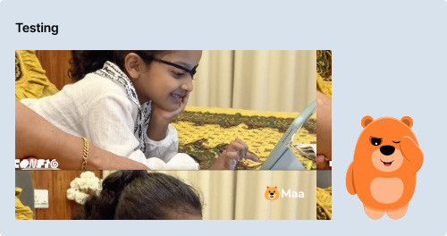
The product was tested end-to-end with real children aged 3 to 7 in a real home, on a real tablet, with a parent operating, exactly as designed. The pirate framing worked immediately: role-play beat instruction, and children kept the eye covered without being told twice. Animal-tap answering needed zero explanation across ages, and children asked to play again, the strongest possible signal for a screening that depends on periodic re-testing.
Real runs also caught what a happy-path demo never would: a data-recording defect in the hearing level, where one ear's rounds could record as "0 of 0" while the summary still interpreted asymmetry. It reshaped my view: for a health product, data integrity is a UX property. A beautiful report with a hollow number is worse than no report.
Maa was an experiment in how much product one designer can ship alone with an AI-native workflow. Figma Agents turned the concept into first screens and a coherent design system. Figma AI generated the illustration world: the bear mascot, forest environments and level art in one consistent style. Figma Make assembled the working product (game logic, scoring, the Web Audio hearing engine and the report generator) and hosts the live build. Claude supported clinical research synthesis, threshold logic and report language.
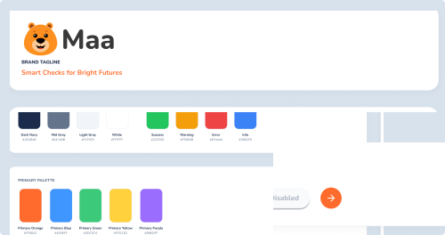
The design system carried the emotional architecture: a five-colour level palette mapped to five animal guides, a warm cream base so no screen ever reads clinical, rounded type and oversized touch targets tuned for small fingers.
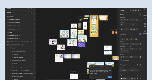
Maa is live on the web: five working screening levels, four languages, the trust layer, and a generated doctor's report, completed by real children in real sessions. For a three-week solo build, shipping complete was the outcome I protected above all others. It was submitted to Config Makeathon 2026 and hand-picked as a Contra Featured project.
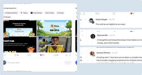
"This will be so helpful to so many."
Dylan Siegel
"A thoughtful and impactful project that makes an important thing simple, and child-friendly."
Abhiram RG
"Amazing work. I love how you've taken a complex healthcare need into a simple, engaging experience for children and parents. Awareness and early intervention is especially powerful."
Janaina Oliveira
The honest part: Maa did not place at Config Makeathon 2026. Studying the winners taught me something worth more than the prize: Config rewarded tools for designers, visually arresting and instantly shareable within the design community, while Maa is a product for parents, strongest on impact criteria. Same product, wrong room. It's now being refined for UX India's Design Pitch 2026, where problem/solution and human-centred design carry 45% of the score.
| TRACK | WHAT'S NEXT |
|---|---|
| Clinical | Clinical advisor review. Independent review of thresholds and screening methods with a paediatric specialist. |
| Product | Analytics + a custom domain. Instrumentation to learn from real sessions, plus a shareable results link and custom domain. |
| Distribution | Pilot conversations. Early conversations with preschools and anganwadi programs about a pilot rollout. |
| Competition | UX India Design Pitch 2026. Refining Maa for the Health & Wellbeing, New Product stage, with a sustainability model: free for parents, licensed reporting for clinics and public-health programs. |
"Maa is a screening, not a diagnosis. But often, a beginning. If even one child gets through the right door in time, every design decision in this document did its job."
Lukhman P, Product Designer, Kochi, Kerala
Next case studyBuilding a B2B SaaS from 0 to 1, reaching 5,000+ users by focusing on accessibility


